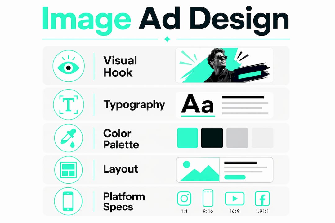
Image ads are defined as paid visual advertisements that use a single graphic or photograph to communicate a brand message across digital platforms. The human brain processes images 60,000x faster than text, which means a well-crafted visual ad can land its hook before a viewer consciously decides to pay attention. Platforms like Meta and Google have built entire ad ecosystems around this cognitive reality, with strict specifications governing everything from file size to aspect ratio. If you’re a marketer or advertiser in 2026, understanding how visual advertising actually works at a technical and psychological level is the difference between a campaign that scales and one that stalls.
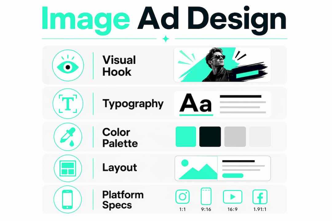
How do image ads capture attention and drive engagement?
Visual advertising works because of how the brain prioritizes information. Images bypass the slower analytical processing that text requires. That speed advantage is why composition techniques like rule of thirds, color contrast, and gaze direction are not just artistic suggestions. They are psychological tools that direct where a viewer looks first, second, and third.
Visual hierarchy is the engine behind every high-performing graphic ad. When a viewer lands on your ad, their eye follows a path. You control that path through size, contrast, and placement. A bold product image draws the eye in. A short value proposition holds it. A clear call-to-action (CTA) closes the loop.
Three techniques consistently outperform generic design approaches:
- Rule of thirds: Place your primary subject at one of the four intersection points of a 3x3 grid. This creates natural tension and visual interest that holds attention longer than centered compositions.
- Color contrast: High contrast between your CTA button and background color increases click visibility. Warm colors like red and orange signal urgency; cool blues and greens signal trust.
- Gaze direction: Images of people looking toward your headline or CTA pull the viewer’s eye in that direction. This is one of the most underused techniques in digital image marketing.
These elements work together to build a persuasive narrative inside a single frame. The goal is not to make something beautiful. The goal is to make something that converts.
Pro Tip: Test your ad creative in grayscale before publishing. If the visual hierarchy disappears without color, your layout is too dependent on color alone and will underperform on low-brightness mobile screens.
What are the key design principles for impactful image ads?
Performance-focused ad creatives prioritize key information visually rather than relying on aesthetics alone. Most campaigns underperform because the creative team treats design as decoration. The hook, value proposition, and CTA must each occupy a deliberate position in the visual frame.
Visual hierarchy and layout
Lead with your strongest visual hook. This is typically your product, a human face, or a bold statement. The value proposition sits in the middle zone, readable in under two seconds. The CTA anchors the bottom or a high-contrast corner. Every element should have a reason to exist in the frame.

Typography and brand personality
Font choice signals brand personality before a viewer reads a single word. Serif fonts communicate authority and tradition. Sans-serif fonts read as modern and direct. Script fonts suggest creativity but sacrifice readability at small sizes. For digital image marketing, body copy should never drop below 16px in the final rendered ad, and headlines should contrast sharply with the background.
Color strategy
Color palettes do two jobs: they convey emotion and they reinforce brand recognition. Consistent use of two or three brand colors across all creative image promotions builds visual memory over time. Viewers who see your color palette repeatedly begin to associate it with your brand before they read your name.
Platform-specific design
Resizing a desktop banner for mobile is not a design strategy. Mobile-first vertical formats like 4:5 and 9:16 deliver higher engagement than landscape designs because they occupy more screen real estate on a phone. Design for the placement first, then adapt for secondary placements.
- Feed placements: 1:1 square or 4:5 vertical for maximum mobile coverage
- Stories and Reels: 9:16 full-screen vertical with key elements in the center 60% of the frame
- Display network banners: 300x250, 728x90, and 160x600 remain the highest-traffic banner image ad sizes on Google’s network
Pro Tip: Build your master creative at 9:16, then crop down to 4:5 and 1:1. You lose less critical content than working in the opposite direction.
What technical specs must advertisers know for image ads in 2026?
Technical specifications are not optional fine print. Ignoring them causes platform recompression, which degrades image quality and reduces ad delivery scores. Both outcomes cost you money.
File size and format requirements
Static display ads are capped at 150 KB, while responsive and social ads allow up to 5,120 KB (5 MB). Exceeding the static cap forces the platform to recompress your image, which introduces artifacts and blurs fine text. JPG works best for photographs; PNG preserves transparency and sharp edges for graphic-heavy designs. WebP is increasingly accepted and delivers smaller file sizes at equivalent quality.
Dimensions and aspect ratios
| Platform | Recommended Size | Aspect Ratio | Max File Size |
|---|---|---|---|
| Google Display (static) | 300x250 px | 6:5 | 150 KB |
| Google Responsive | 1200x628 px | 1.91:1 | 5,120 KB |
| Meta Feed (mobile) | 1080x1350 px | 4:5 | 30 MB |
| Meta Stories | 1080x1920 px | 9:16 | 30 MB |
| Google Discovery | 1200x1200 px | 1:1 | 5,120 KB |
Center-safe zones
Keep essential elements within the center 80% of your image. Responsive placements automatically crop images to fit different ad slots. Any product shot, headline, or CTA placed near the edges risks being cut off entirely. This is especially critical for banner image ads running across Google’s Display Network, where the same creative serves dozens of different slot sizes.
Pro Tip: Create a template overlay in your design tool that marks the outer 10% of the canvas as a “no-go zone.” Lock it as a reference layer and never place critical content outside it.
How can advertisers optimize image ads with testing and AI?
Testing is not optional for effective image campaigns. Testing at least four visual variations simultaneously is the industry standard for identifying which creative resonates with specific audience segments. Running fewer variants means you are making decisions on insufficient data.
Multi-variant testing should cover these variables independently:
- Hook image: Product shot vs. lifestyle photo vs. human face
- Color palette: Brand colors vs. high-contrast alternatives
- CTA copy: Action-oriented (“Get yours”) vs. benefit-oriented (“Save 30% today”)
- Layout: Text-heavy vs. image-dominant compositions
Generative AI has changed how creative teams approach this testing volume. AI-generated visuals can yield higher click-through rates and better brand consistency than purely aesthetic-driven human designs, but the technology faces two real challenges: the search problem (generating genuinely novel creative angles) and the alignment problem (keeping AI output on-brand). The most effective frameworks combine generative AI with Bayesian neural networks to select high-performing visuals that also meet brand guidelines.
“Generative AI bridges the creative performance and brand alignment gap through active learning frameworks that continuously refine which visuals perform and which stay on-brand. The result is a feedback loop that human-only creative teams cannot match at scale.”
Practically, this means using AI to generate your initial batch of creative variants, then applying human judgment to filter for brand fit before testing. AI handles volume. Humans handle judgment. Neither works as well alone.
How to build an image advertising strategy for your brand
A repeatable image advertising strategy requires more than good creative. It requires a system that connects brand identity, audience behavior, and platform data into a single workflow.
- Set clear objectives before designing anything. Awareness campaigns need high-contrast, memorable visuals. Conversion campaigns need clear CTAs and product-forward layouts. Mixing these goals in a single creative produces mediocre results for both.
- Build comprehensive brand guidelines for visuals. Document your approved color palette (with hex codes), font pairings, logo placement rules, and photography style. Every designer brief should reference this document.
- Map platform behavior to creative format. Instagram users scroll fast and respond to bold color. Google Display audiences are in browsing mode and respond to clear product shots with price anchors. Design for the mindset, not just the screen size.
- Schedule testing cycles, not one-off tests. Run a four-variant test every two to four weeks. Kill the bottom two performers. Introduce two new variants based on what the winners tell you. This iterative loop compounds over time.
- Track creative fatigue. Even winning creatives decay. When click-through rates drop more than 20% from their peak, retire the creative and rotate in fresh variants from your swipe-file.
The brands that win at visual advertising are not the ones with the biggest budgets. They are the ones with the most disciplined creative testing process.
Key Takeaways
Effective image ads combine psychological design principles, platform-specific technical compliance, and systematic multi-variant testing to drive consistent conversion gains.
| Point | Details |
|---|---|
| Visual processing speed | The brain processes images 60,000x faster than text, making visual hooks your most powerful conversion tool. |
| Platform-native design | Build for mobile-first vertical formats (4:5, 9:16) rather than resizing desktop creatives. |
| Technical compliance | Keep static ads under 150 KB and place all critical elements within the center 80% of the frame. |
| Multi-variant testing | Test at least four creative variations simultaneously to identify top performers quickly. |
| AI plus human judgment | Use generative AI for creative volume and human review for brand alignment before launching. |
What I’ve learned from watching thousands of image ad campaigns
The most common mistake I see is treating creative as a one-time decision. Marketers spend weeks perfecting a single ad, launch it, and then leave it running until performance collapses. That is not a strategy. That is hope.
The shift to visual-first marketing is real, but the brands winning in 2026 are not winning because their ads look better. They are winning because they test faster. They decode what works in a winning ad, strip it down to its core angle and hook, and rebuild it in five new variations before their competitors have finished their first round of approvals.
Platform-specific customization matters more than most teams admit. An ad that performs well on Instagram Stories will not automatically translate to Google Display. The audience mindset, scroll speed, and visual context are completely different. Treating them as the same placement is one of the most expensive assumptions in digital image marketing.
The other pitfall I see constantly: ignoring technical specs until the ad is already live. Recompression artifacts on a product shot destroy credibility instantly. A CTA cropped off by a responsive placement wastes every dollar behind that impression. Build compliance into your production checklist, not your post-launch audit.
Data-driven creative decisions beat aesthetic instincts every time. Not because instincts are wrong, but because data tells you which instincts are right for this audience, on this platform, at this moment.
How Socialfuel helps you build better image ad campaigns
Socialfuel is built for marketers who want to skip the guesswork and go straight to what works. With Socialfuel, you can search winning ad creatives across Facebook, Instagram, Google, and YouTube by brand, keyword, or URL. You see the hooks, angles, and design choices behind the highest-performing campaigns in your category.
Every ad you save becomes part of your swipe-file. You can decode the creative strategy behind entire campaigns, not just individual ads. That intelligence feeds directly into your designer briefs, your testing roadmap, and your competitive playbook. If you want to build image ad campaigns that convert faster and waste less budget, Socialfuel gives you the creative intelligence to do it.
FAQ
What are image ads in digital marketing?
Image ads are paid advertisements that use a single static graphic or photograph to deliver a brand message on digital platforms. They appear across social feeds, display networks, and search results pages on platforms like Meta and Google.
Why use image ads over other ad formats?
The brain processes visuals 60,000x faster than text, giving image-based ads a speed advantage in capturing attention before a viewer scrolls past. They also tend to have lower production costs than video while still driving strong engagement.
What file size should image ads be?
Static display ads must stay under 150 KB to avoid platform recompression, while responsive and social ads can go up to 5,120 KB. Always check the specific platform’s current specs before exporting your final creative.
How many image ad variations should I test?
Testing at least four variations simultaneously is the industry standard. Running fewer variants produces unreliable data and slows down your ability to identify the strongest creative.
How does AI improve image ad performance?
Generative AI expands the volume of creative variants a team can test, and frameworks combining AI with Bayesian neural networks help select visuals that are both high-performing and brand-consistent. Human review remains necessary to filter for brand alignment before any AI-generated creative goes live.